UX Project For Notetakr App
(Final Product + Research Rationale)
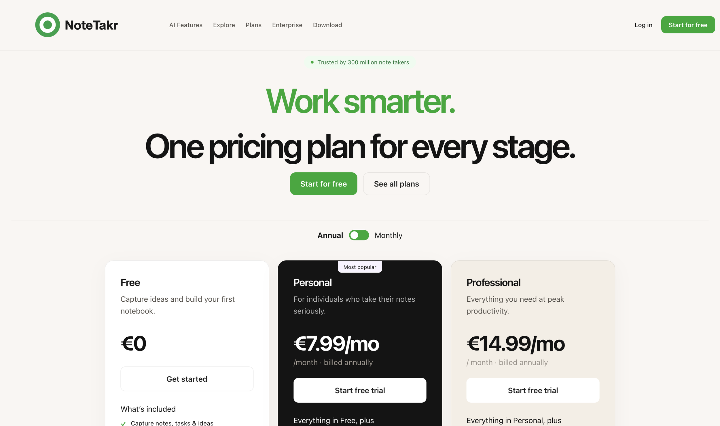
Visit the Website for the Full Experience
Design decisions, UX principles, and rationale:
I structured the pricing page so that Free, Personal, and Professional plans are all
visible within the same initial view to support easy comparison and reduce cognitive
load through recognition over recall (Nielsen, 1994). I positioned the free plan first and
styled it neutrally to reduce psychological resistance and create a clearer progression
between tiers.
This ordering also creates an anchoring effect, where the Free plan establishes a
baseline that makes the personal plan feel more reasonable in comparison, aligning
with behavioural principles described by Tversky & Kahneman (1974). I also used the
Von Restorff effect by visually emphasising the recommended plan, so it stands out and
attracts user attention.
Each pricing card only includes features unique to that tier to reduce redundancy and
simplify decision-making in line with Hick’s Law (Hick, 1952). However, I still provided a
full breakdown of all features in a comparison table at the bottom of the page, giving
users the option to scroll and explore details at their own pace. This detailed
comparison is split up into sections to be easier to read.
Research process, competitors, and design justification:
I chose to deliver this as a web-based pricing page because pricing UX directly
influences conversion rates and subscription uptake. The layout and hierarchy of
information significantly affect user confidence when selecting a plan. To inform my
design decisions, I conducted competitive research across freemium productivity
tools, particularly Notion, which has become one of the most successful SaaS
freemium models.
A key influence on my design was the simplicity of modern freemium interfaces that
prioritise clarity over density. If I had access to deeper product analytics, I would
evaluate where users drop off in the onboarding-to-subscription process.
Testing methodology, validation, and evaluation plan:
To evaluate whether this design improves clarity and conversion, I would conduct a
combination of qualitative and quantitative user testing methods. First, I would run 5-
second tests, where users are shown the pricing page briefly and then asked what they
remember. This tests clarity and information hierarchy. I would also use structured
interviews asking users:
1. Which plan would you choose and why?
2. What differences between plans stood out most?
3.Did you feel overwhelmed by information?
These methods align with Nielsen’s Usability Heuristics (Nielsen, 1994), particularly
visibility of system status and recognition rather than recall.
For broader validation, I would gather feedback from both students and professionals
who regularly use note-taking tools, ensuring a mix of novice and experienced users. I
would also review behavioural data post-launch to determine whether the redesign
improves engagement and reduces decision friction.
References (UX + behavioural theory):
Hick, W. E. (1952). On the rate of gain of information.
Nielsen, J. (1994). 10 Usability Heuristics for User Interface Design.
Sweller, J. (1988). Cognitive Load During Problem Solving.
Tversky, A. & Kahneman, D. (1974). Judgment under Uncertainty: Heuristics and Biases.
Evernote pricing model analysis (product UX reference)
Notion freemium adoption model research